Minimising Cart Abandonment: A Frictionless Approach to E-Commerce Checkout Design

The digital marketplace demands an uncompromising focus on e-commerce UX, particularly at the point of transaction. Within modern digital retail pipelines, the checkout user journey represents the definitive bridge between consumer intent and revenue generation. Yet, it remains one of the most volatile stages of the conversion funnel, frequently compromised by design inefficiencies that induce cognitive fatigue and sudden shopping cart abandonment.
To build a high-converting digital storefront, enterprises must treat checkout page optimization not merely as a functional necessity, but as a core strategic asset. By understanding the psychological and structural barriers that cause users to falter at the final hurdle, design teams can systematically eliminate friction and improve e-commerce conversion rates. This article examines the critical touchpoints of transaction design, offering actionable methodologies to streamline workflows, enhance user experience design, and maximize customer retention.
The Cognitive Cost of Interaction

Every input field, decision point, and layout choice imposes a measurable cognitive load on the user. When a checkout interface demands excessive effort, users experience decision fatigue, which often manifests as cart abandonment. Minimising this cognitive friction requires a rigorous assessment of what data is truly essential to complete the transaction.
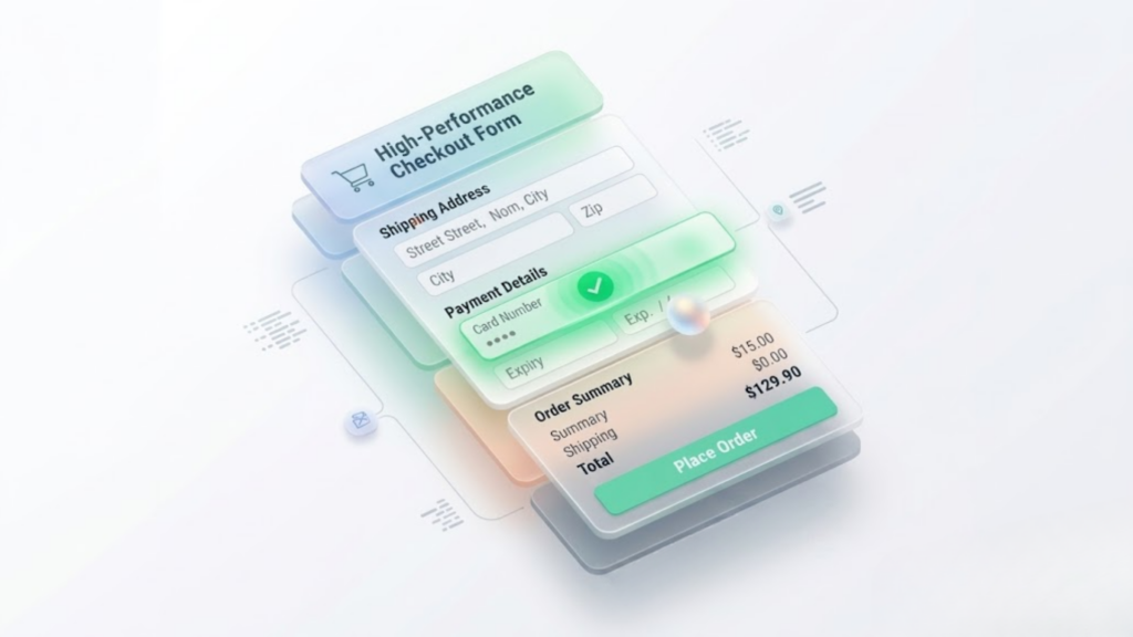
Prototyping teams must advocate for radical simplicity by challenging the necessity of every form field. For example, forcing users to input their address details across multiple disjointed text boxes increases error rates and interaction time. By implementing address autocomplete functionalities and clear error-validation mechanisms, interfaces can dramatically reduce the physical and mental effort required to finish a purchase.
The Case for Guest Checkout Modalities
One of the most persistent barriers to digital conversion is the mandatory creation of a user account prior to purchase. Whilst businesses understandably desire historical user data for long-term marketing campaigns, forcing registration breaks the momentum of the transaction. It signals to the consumer that their immediate goal is secondary to the platform’s data collection objectives.
Providing a prominent guest checkout option respects the user’s time and autonomy, removing an unnecessary psychological barrier. Account creation can be positioned more effectively after the transaction is complete, framing it as a convenience for order tracking rather than a prerequisite for purchase. This shift in sequencing preserves initial conversion rates whilst still fulfilling customer relationship management goals.

Optimising Form Architecture and Information Layout
The physical structure of a checkout form directly influences a user’s perception of complexity. Dense, multi-column layouts frequently disorientate the eye, causing users to misinterpret fields or skip mandatory sections. A structured, single-column layout provides a predictable visual path, guiding the individual naturally from top to bottom.
Furthermore, inline validation serves as an essential tool for real-time reassurance. Rather than waiting for a user to click the final submission button only to return a list of ambiguous errors, interfaces should validate input dynamically. Clear, immediate visual feedback helps users correct mistakes instantly, preventing the frustration that leads to session termination.
Progress Indicators and Process Transparency
Uncertainty is a significant driver of abandonment. When users cannot anticipate how many steps remain in a checkout sequence, they become impatient. Integrating a linear progress indicator establishes clear expectations, mapping out exactly where the user stands within the transaction pipeline.
These indicators must be explicit, functional, and accurately reflective of the journey. By breaking the process into logical segments, such as shipping, payment, and review, the interface transforms a potentially overwhelming task into a series of manageable milestones. This transparent structure instils confidence, encouraging the user to proceed to the final confirmation.

Mitigating Price Shock Through Upfront Clarity
Unexpected costs surfaced at the final stage of a purchase are universally detrimental to conversion rates. When shipping fees, local taxes, or processing charges are hidden until the final review screen, users feel misled. This lack of transparency undermines brand trust and abruptly reverses the intent to buy.
E-commerce architectures should surface pricing variables as early as possible within the browsing or cart viewing phase. Providing calculators based on postal codes prior to checkout ensures that the final figure matches user expectations. Total financial transparency fosters goodwill and solidifies the commitment to purchase before the user enters the transaction funnel.
Future-Proofing the E-Commerce Conversion Funnel
Sustaining a competitive advantage in digital retail requires continuous, data-driven checkout page optimization. By dismantling systemic friction points—such as mandatory account creation, convoluted form layouts, and unexpected costs—organizations can dramatically reduce shopping cart abandonment and build lasting consumer trust.
Ultimately, an intuitive, frictionless checkout user journey respects the shopper’s time and cognitive boundaries. Prioritizing seamless e-commerce UX and transparent pricing structures does more than just solve immediate technical hurdles; it transforms a basic transactional necessity into a high-performing strategic asset that consistently drives e-commerce conversion rates upward.