Maximising Digital ROI: The Strategic Value of Cross-Platform UX Harmonisation
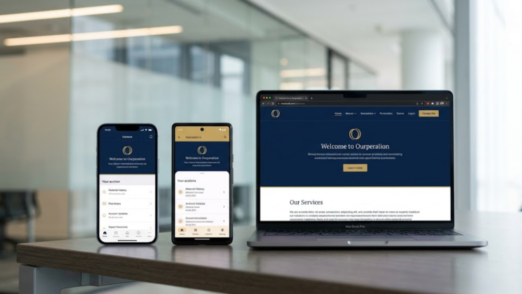
In the modern digital economy, a enterprise asset is rarely confined to a single operating system. Users routinely interact with products across mobile applications and desktop web browsers, expecting a transition that feels continuous. However, achieving this continuity presents a significant operational challenge. iOS, Android, and web platforms operate on fundamentally different architectural standards, navigation paradigms, and user expectations.
The objective of an enterprise digital strategy is not to enforce absolute uniformity, which often violates platform-specific usability rules, but to achieve functional harmony. True cross-platform consistency ensures that whilst the interface respects the native constraints of the hosting environment, the overarching brand logic, workflow efficiency, and psychological experience remain unified.
The Friction Between Platform Paradigms and Corporate Identity
The primary obstacle to harmonisation lies in the inherent conflict between native design languages and corporate brand guidelines. Apple utilizes the Human Interface Guidelines, which place a premium on crisp typography, fluid transitions, and minimalist layouts. Google employs Material Design, a system built around tangible surfaces, intentional shadows, and expressive components. The web, governed by browser flexibility and responsive grid systems, presents an entirely different set of interactive expectations.
When an organisation attempts to force an exact visual clone of an iOS application onto Android, or vice versa, it creates immediate friction for the user. For instance, forcing a bottom tab bar onto an older Android implementation where users naturally look for a top navigation structure can degrade usability. Conversely, ignoring native paradigms entirely to impose a rigid brand aesthetic can result in an interface that feels foreign and cumbersome to the end-user.
The strategic solution requires a clear distinction between visual identity and functional mechanics. Brands must define non-negotiable core components, such as typography weights, colour systems, and tone of voice, whilst allowing structural layouts to adapt to the expectations of the specific operating system.
Methodologies for Unified Digital Architecture

To bridge these platform differences without fracturing the user experience, engineering and design teams must employ structured frameworks. The following methodologies serve to maintain coherence across complex digital ecosystems.
The Foundation of Agnostic Design Systems

A robust, platform-agnostic design system is the most effective instrument for scaling digital products. Rather than constructing separate component libraries for each environment, teams should establish a centralized system built upon design tokens.
Design tokens are the foundational building blocks of an interface, represented as data. These tokens store variables such as exact hex codes for colours, spacing values, animation curves, and typographic hierarchies. When these variables are modified in the central repository, the changes propagate automatically across iOS, Android, and web applications. This ensures that the primary brand palette remains identical across all touchpoints, whilst the rendering engine translates those values into native code.
Adaptability Over Replication
Structural layouts must follow the philosophy of adaptation rather than exact replication. This approach respects native navigation patterns whilst preserving the mental models that users form when interacting with a brand.
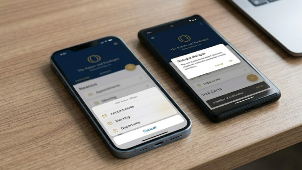
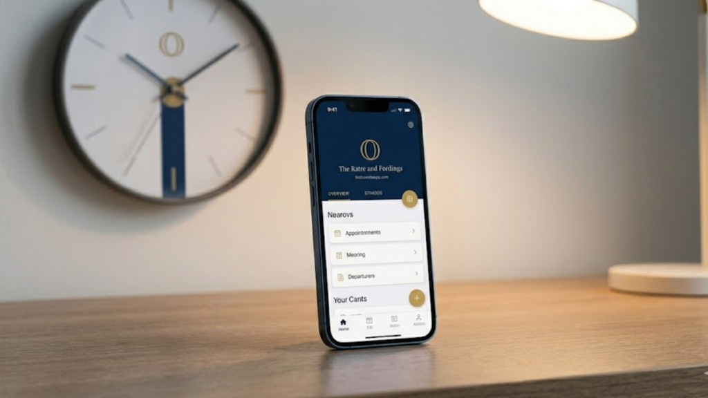
- Navigation Systems: iOS traditionally relies on a bottom tab bar for primary destinations, whereas Android frequently utilizes a navigation drawer or top tabs. The web platform benefits from persistent top navigation or left-hand sidebars. A harmonised strategy allows these structures to differ, provided the nomenclature and destination hierarchy remain identical.
- Interactive Elements: Contextual menus, dialogue boxes, and date pickers should leverage native components. Users have developed muscle memory for handling native date wheels on iOS or calendar grids on Android. Forcing a custom, non-native element often increases cognitive load and reduces conversion rates.
- Tactile Feedback and Motion: Micro-interactions and animations should feel native to the device. Material Design uses ripple effects upon button presses, whereas iOS uses subtle scale shifts or opacity changes. Aligning with these native expectations makes the application feel responsive and reliable.
Mitigating Market Risk Through Strategic Research
The implementation of a cross-platform strategy should never be guided by internal assumptions. It requires a rigorous, data-driven approach divided into clear stages of discovery, exploration, and empirical testing.
During the discovery phase, teams must audit the specific behaviours of the target audience across different devices. User demographics often dictate platform preferences, and cross-platform usage patterns vary by industry. For instance, an e-commerce platform may find that users conduct initial product discovery via mobile browsers but execute final transactions on a desktop system.
Exploration involves prototyping user flows across parallel devices simultaneously. Designers must validate how a specific task, such as updating payment information, scales down from a wide web interface to a compact mobile screen. Finally, rigorous testing across real devices ensures that performance benchmarks, loading times, and accessibility standards are met uniformly, minimizing the risk of post-launch friction.
Conclusion
Achieving cross-platform consistency is not an aesthetic exercise in mirroring interfaces across different screens. It is a strategic effort to harmonise corporate identity with native functionality. By establishing a centralized design system rooted in design tokens and prioritizing platform-specific user expectations over rigid uniformity, organisations can build digital products that feel both distinctly unique to the brand and deeply intuitive to the platform user. This balanced approach ultimately reduces operational fragmentation, accelerates development cycles, and secures long-term user loyalty across the entire digital ecosystem.