Strategic Branding: Cultivating Emotional Resonance in Competitive Digital Markets

There is a moment, usually less than a second long, when someone lands on a website or opens an app for the first time. In that tiny window, before they have read a single word, they have already made a judgment about who you are. Are you trustworthy or careless. Serious or playful. Expensive or approachable. None of that comes from your product description. It comes from the shape of your logo, the weight of your font, the color sitting behind your call to action button.
This is the quiet power of visual identity. It does the emotional groundwork before language even gets a chance to speak. And in digital markets so crowded that attention barely lasts a scroll, that groundwork often decides whether someone stays or leaves.

Branding Is a Feeling Before It Is a Logo
Founders often think of branding as a logo, a color palette, and maybe a tagline. In reality, branding is the feeling a person carries away after every interaction with you. It is built in layers, and visual design is the fastest layer to reach someone’s emotions, faster than copywriting, faster than product features, faster than price.
A brand that feels warm and human will use rounded shapes and soft color transitions. A brand that wants to feel precise and trustworthy, like a bank or a health platform, will lean on sharper lines and more restrained color. Neither approach is right or wrong. What matters is whether the visual language actually matches the values the company claims to hold. Mismatches are where trust quietly breaks down, even if the person browsing your site could never explain exactly why something feels off.
Typography Carries a Tone of Voice You Cannot Hear
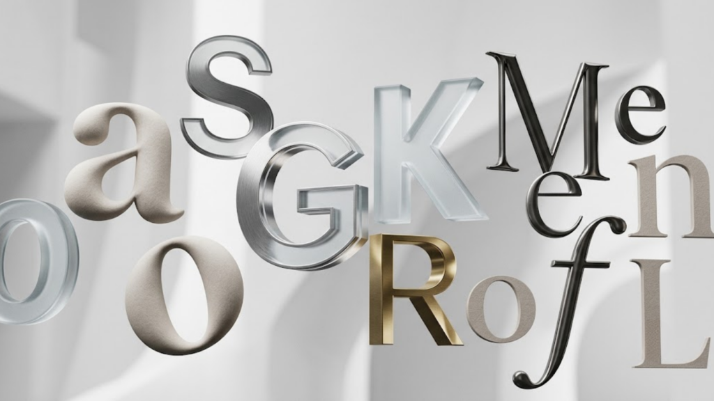
Typography is often the most underestimated tool in a brand’s toolkit. People do not consciously notice fonts, yet fonts shape how every single word on a page is received. A rounded, friendly typeface makes a message feel approachable and casual. A sharp, geometric sans serif makes the same message feel modern and efficient. A classic serif, on the other hand, can lend a sense of heritage and authority.
This is why the biggest brands guard their typography choices as fiercely as their logos. The letterforms are doing emotional labor that most visitors will never consciously register, but will absolutely feel. Get the typography wrong, and even beautifully written copy can end up feeling cheap, cold, or untrustworthy.
Grid Structures Give a Brand Its Sense of Order
If typography is the voice, grid structure is the posture. A grid is the invisible skeleton that holds a layout together, and it says a surprising amount about a company’s discipline and values, even though most users could never point to it directly.

A tight, consistent grid with generous white space signals confidence and clarity, the kind of composure you might expect from a premium product or a serious financial institution. A looser, more playful grid, with elements breaking out of straight lines, can signal creativity and energy, well suited to a lifestyle or entertainment brand. Consistency across every page, every screen, every email, is what turns a scattered set of visuals into something that feels like a single, coherent presence. Inconsistency, even small inconsistency, chips away at the feeling that a brand knows exactly who it is.
Color Theory and the Emotions Nobody Talks About
Color is probably the most emotionally loaded design decision a brand makes, and also the most misunderstood. Blue is often chosen because it reads as calm and dependable, which is why so many financial and healthcare brands use it. Red signals urgency and passion, useful for brands built around energy or appetite. Green speaks to growth, health, and sustainability.
But color does not work in isolation. It is the relationship between colors, their contrast, saturation, and how they are used across a digital product, that actually builds an emotional signature over time. A brand that repeats the same considered palette across every touchpoint slowly trains its audience to feel something specific the instant they see that color combination again, long before they consciously recognize the brand itself. That is not decoration. That is identity being built one repeated exposure at a time.
When All the Pieces Actually Work Together
None of these elements, typography, grid, or color, do much good in isolation. Their real power shows up when they work together as one coordinated system, reinforcing the same story from every angle. A confident color palette paired with sloppy typography will confuse a visitor just as much as a beautiful font paired with a chaotic layout. Strategic branding is not about picking pretty individual pieces. It is about orchestration, making sure every visual decision is quietly pointing in the same emotional direction.

Conclusion
In a digital market where competitors are one tab away, emotional resonance has become one of the few genuine advantages left. Products can be copied. Features can be matched within a quarter. But a brand that has spent real thought on how its typography, grid, and color work together to express its values builds something far harder to imitate: a feeling people associate only with you. That feeling is what turns a first visit into a returning customer, and a returning customer into someone who recommends you without being asked. In the end, strategic branding is not about looking good. It is about being remembered, and trusted, for exactly the right reasons.