The Typography of Usability: How Type Selection Directs Digital Navigation
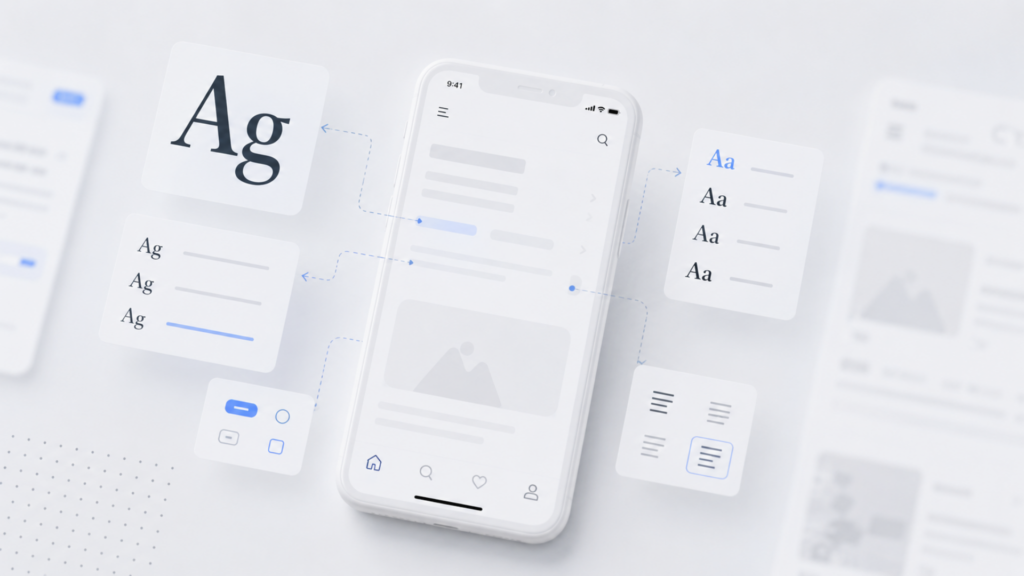
Type is one of those design choices people notice only when it goes wrong. A menu that is hard to scan, a paragraph that feels like a wall of grey, a heading that gets lost on a small screen, these are all typography problems wearing the disguise of “bad UX.” In reality, typography is one of the strongest tools a designer has for guiding attention, building trust, and making a website feel usable rather than just visible.
This article looks at how font choice, readability, and hierarchy work together across devices, and why treating typography as a strategic layer of web design, not a cosmetic afterthought, changes how people navigate and convert on a site.
Why Typography Is a Usability Tool, Not a Style Choice
Every website is, at its core, a reading experience. Before a visitor clicks a button or fills out a form, they are scanning text to decide whether to trust the page at all. Font pairing, line spacing, and letter size quietly signal whether a brand feels professional or careless.
Good typography reduces cognitive load. When body text sits at a comfortable size with enough line height, readers process information faster and retain more of it. Poor typography does the opposite. It forces the eye to work harder, and tired eyes close tabs. This is why typography sits so close to conversion rate optimization: a visitor who struggles to read your pricing page is a visitor who leaves before reading your offer.
Visual Hierarchy: Guiding the Eye Before the Click
Visual hierarchy is the order in which a reader’s eye moves through a page. Typography builds that order through size, weight, spacing, and contrast. A large, bold headline tells the brain “start here.” A smaller subheading says “this is a supporting point.” Body copy, set smaller still, carries the detail.
This hierarchy matters most on pages where users are deciding something, a checkout screen, a signup form, a landing page for a new product. If every piece of text looks the same size and weight, the page has no hierarchy, and the user has no clear path. They are left to figure out priority on their own, and most will not bother.

A well-built hierarchy usually follows a simple ratio system: headline, subheadline, and body copy scaled in proportion to each other, often loosely following something close to a golden ratio relationship. This creates rhythm without needing decoration. The type itself does the work of directing attention.
Readability Across Devices: The Real Test of Type Selection
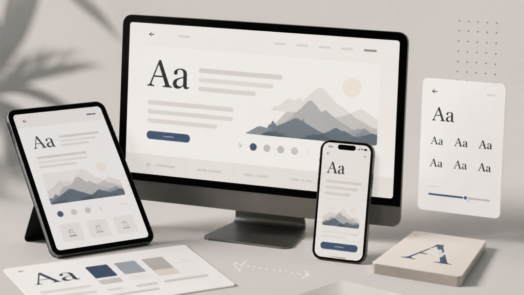
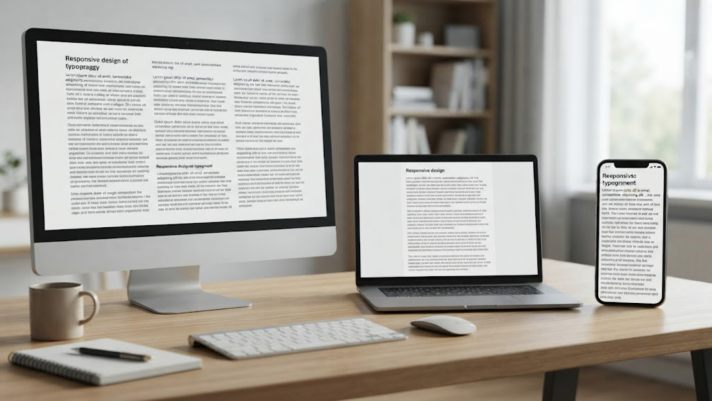
A typeface that looks sharp on a designer’s 27-inch monitor can turn into a smudge on a mid-range phone screen. This is where responsive typography earns its importance. Digital navigation today happens across a huge range of screen sizes and resolutions, and type has to hold its shape and legibility at every one of them.
A few practical rules tend to hold up across device types:
- Minimum body text size on mobile should generally sit around 16px, since anything smaller pushes users into pinch-zooming, which breaks the flow of reading.
- Line length matters as much as font size. Long, unbroken lines of text are exhausting to track on a wide desktop layout, while overly narrow columns on mobile create choppy, broken reading rhythm.
- Line height (leading) needs to loosen slightly on smaller screens, since tight spacing that reads fine on desktop can feel cramped on a phone.
- Font weight and contrast should be tested against different backgrounds and lighting conditions, since a thin, light-grey font might look elegant in a mockup and disappear entirely in bright sunlight on someone’s phone.
Responsive typography is not simply about scaling a font down proportionally. It is about rethinking size, spacing, and contrast for each context so the reading experience holds steady, whether someone is on a laptop, a tablet, or a five-inch phone screen.
Choosing the Right Typeface for Web Navigation
Font choice affects more than aesthetics, it shapes how quickly users can navigate a site’s structure. Sans-serif fonts tend to dominate web interfaces because their clean, simple letterforms render well at small sizes and on lower-resolution screens. Serif fonts can still work beautifully in web design, particularly for editorial content or brand storytelling, but they need larger sizes and more careful spacing to stay legible on screens.
Beyond the typeface family itself, consistency across a site matters just as much. Mixing too many fonts, or using inconsistent sizing for the same type of content across pages, breaks the sense of a coherent system. Users learn a site’s visual language quickly. If a heading style shifts from page to page, that consistency, and the trust that comes with it, breaks down.
Typography as a Conversion and SEO Signal
Search engines and users are, in different ways, both judging the same thing: how easy your content is to consume. Google’s page experience signals reward sites where content is easy to read and interact with on mobile, which means typography decisions can quietly influence SEO performance alongside user experience.
On the conversion side, readable, well-structured typography keeps users on a page longer, reduces bounce rates, and makes calls to action easier to spot. A pricing table with clear typographic hierarchy converts differently than one where every number and label looks identical in weight and size.
Bringing It Together
Typography is not decoration sitting on top of a website. It is infrastructure. It determines how fast someone can scan a page, how much they trust what they are reading, and whether they make it to the button you want them to click. Treating type selection as a usability decision, not just a branding one, is what separates a site that merely looks good from one that actually performs across every device it is opened on.
Getting this right consistently, across dozens of screen sizes and constantly shifting user behavior, is exactly the kind of detail-heavy work that benefits from senior design judgement rather than guesswork, which is where a dedicated UX partner like Onyx UX Studio tends to make the difference between a site that looks fine and one that quietly performs.