A Translation Is Not a Localisation
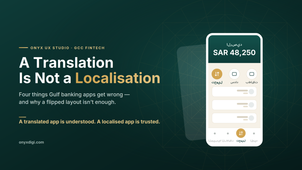
Why a Saudi banking app needs more than a flipped layout
Picture two people opening their banking app on a Tuesday morning. One is in Chicago. One is in Riyadh. On paper they are doing the same things — checking a balance, paying a bill, moving a little money to family. So most teams build one app, translate the words into Arabic, flip the screen from left to right, and ship it to the Gulf.
It almost works. And “almost” is exactly the problem.
In more than two decades of designing digital products, I have learned that the most expensive mistakes in this region are rarely about features. They are about the small, quiet decisions that tell a user — in the first few seconds — whether an app was built for them or simply handed to them. A Gulf banking customer feels that difference immediately, even if they could never put it into words. They just sense that something is slightly off, and they trust the app a little less.
Here are four of those decisions. None of them are technical. All of them are routinely missed.
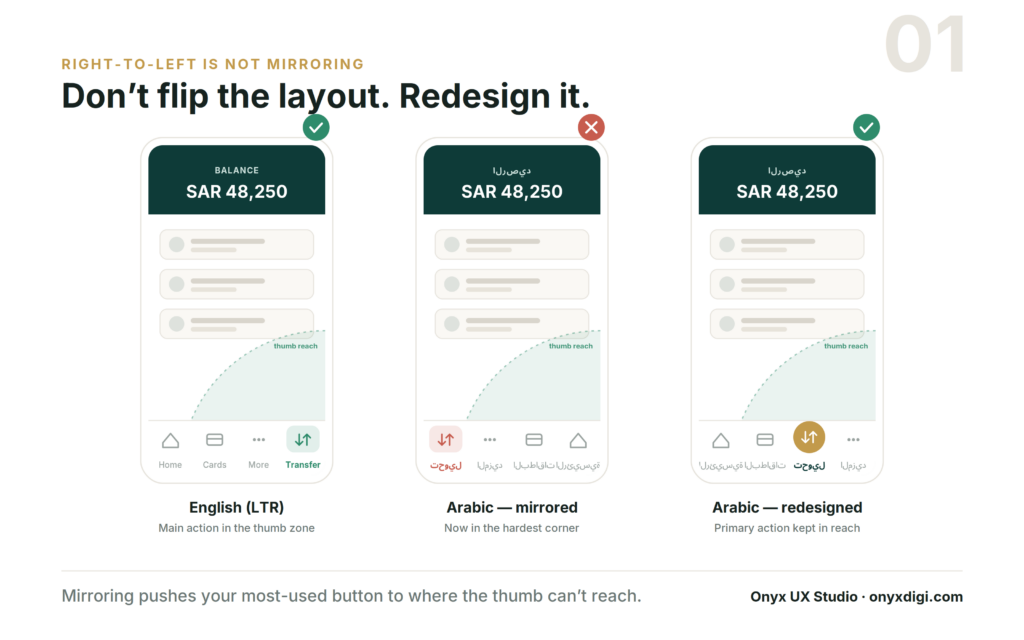
1. Right-to-left is not the same as mirroring
When a team adapts an app for Arabic, the usual instinct is to take the English screen and flip it, like holding it up to a mirror. Everything that sat on the right now sits on the left. Job done.
The trouble shows up in the row of buttons at the bottom of the screen — the menu you tap all day without thinking. In the English version, the main action, say “Transfer,” usually sits toward the bottom-right, because that is the easiest place for a right-handed thumb to reach. Flip the whole screen and “Transfer” slides over to the bottom-left: the single hardest corner to reach without shifting your grip on the phone.
So the most-used button in the entire app becomes the most awkward to press. Nobody decided that on purpose. It happened automatically, because the layout was mirrored instead of designed.
The fix is not clever or expensive. It is simply to treat the Arabic version as its own design — to ask “where does the thumb actually go here, and what does this person reach for most?” — and to place the important actions accordingly, rather than letting a mirror make the decision for you.
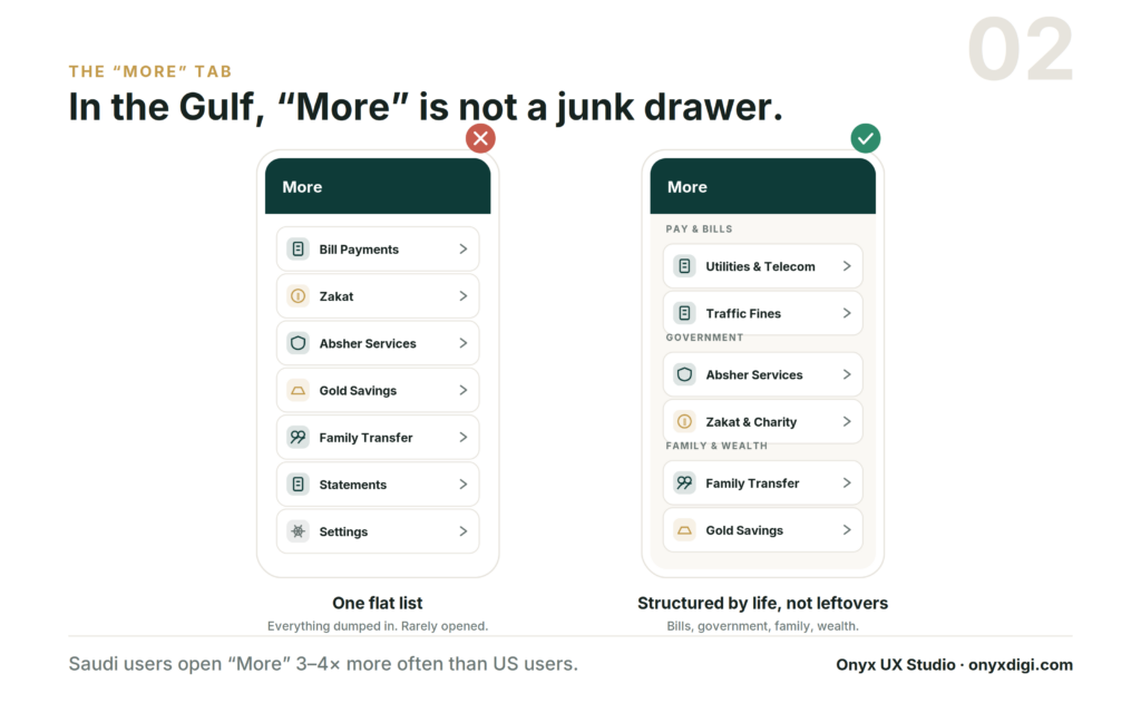
2. The “More” tab carries a much heavier load
Open almost any banking app and you will find a “More” tab tucked into the corner — a quiet drawer for the things nobody expects you to use often.
In the Gulf, that assumption is simply wrong. A customer here opens “More” three to four times as often as a customer in the West, and the reason is straightforward: far more of daily life is bundled into the banking app. Paying the electricity and phone bills. Government services. Zakat. Sending money to family. Buying gold. Settling traffic fines. In many households the bank app is the financial command centre for the whole family, not just a place to glance at a balance once a week.
When that much sits behind one tab, “More” cannot be a junk drawer where leftover features are dumped into a long, flat list. It needs real structure — clear, sensible groups for bills, government services, family transfers and savings — so people can find what they need without scrolling and squinting. Treating “More” as an afterthought in a Gulf app is like building the busiest junction in the city and forgetting to put up any signs.
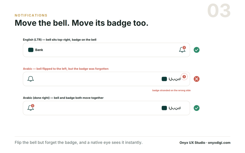
3. A small icon in the wrong corner
The notification bell seems far too small to matter. In an English app it sits in the top-right; flip the layout for Arabic and it moves to the top-left. So far, so simple.
But the bell almost always carries a tiny red badge — the count of unread alerts. When a team moves the bell and forgets to move the badge along with it, that little number ends up stranded on the opposite side of the screen, floating away from the icon it belongs to. To anyone outside the region, the screen looks perfectly fine. To a local user, it looks broken — the digital equivalent of a crooked sign hanging over a shop door.
The frustrating part is that this kind of mistake usually sails through testing. A team checking the app from outside the region simply does not feel that anything is wrong. The app “works.” It just quietly signals to every local user that the people who built it were not really paying attention to them.
4. The empty avatar is never really empty
Every app has a default profile picture for people who have not uploaded one of their own. In much of the world that default is a forgettable grey silhouette of a head and shoulders, and it barely registers.
In the Gulf, it registers a great deal. Many users here — women in particular — will choose not to upload a personal photo at all. That is not a rare edge case to be tidied away later; for a very large share of customers it is the normal, permanent state of their account. Which means the default picture is not a temporary placeholder. It is the face of the account, seen every single day.
A generic grey stranger sends a quiet message: this app pictured a different kind of person using it. A thoughtful default does the exact opposite. A calligraphic monogram, an elegant geometric mark, a warm pattern — anything considered — tells the user that this space was made with them in mind. It costs almost nothing to design, and it changes how the entire product feels from the very first screen.
The difference between translating and belonging
Notice what these four things have in common. Not one of them is about code, speed or features. Each is a small decision about whether the product was shaped around the person actually using it.
This is the line between translation and localisation, and it is worth being precise about. Translation swaps the words. Localisation rebuilds the experience so it feels native — so it feels like it was made here, not merely made available here. A translated app is understood. A localised app is trusted. And in financial services, where the entire relationship rests on trust, that gap is not a detail. It is the whole game.
If you are a founder building for this market, you do not need to become a design expert to protect yourself from this. You need to ask one honest question of whoever is building your product: have you actually shipped here before? Someone who has will already be thinking about the thumb, the “More” tab, the badge and the avatar — along with a hundred other small things that never appear on a feature list but quietly decide whether people stay or leave.
Because in the end, your customers will never tell you the bell is in the wrong corner. They will simply feel that the app was not built for them — and quietly switch to the one that was.